A Quick Look at the New PS3 Box Design
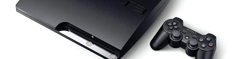
With the release of Uncharted 2 today, Sony is marking the beginning of a new box art design. Obviously this has been in the works since the PS3 Slim was launched, as the design fits very well into the new PS3 (rather than PLAYSTATION 3) branding.
Take a look at two highly anticipated games that were released today. Brutal Legend to the left and Uncharted 2 on the right.


Notice how many things have changed. The Playstation name no longer is printed vertically on the left edge of the image. Instead it is now a simple PS3 with the classic Playstation logo across the top. It should be noted that all three major home consoles now have system labels across the tops of their games. Check out the similarities in the art designs of the old and new Playstation 3’s.


Gone is the curiously Spiderman-esq font and what can’t be seen in these images is the change in the spine graphics as well. There is no more red Spiderman PS3 logo at the top. So thanks Sony, now my friggin’ PS3 collection won’t match when sitting on my shelf.
Overall I’d say that its an improvement over the clumsy design of the original boxes. I don’t know, there just is something visually unpleasent about a label or logo running vertically down the box art. Maybe with this COMPLETE re-branding, Sony is trying to force consumers to forget that whole price thing from previous years.